Showing posts with label book covers. Show all posts

Friday, January 13, 2023

Cover Reveal: Magic City Blues

Guest Post by Bobby Mathews

I never met Robert B. Parker, but I owe him. I found the Spenser novels by chance — and coincidentally, the book was called Chance as well — when I was in my mid-20s. College was over, and I was drifting, with no real sense of who I was or wanted to be. I was nearly feral with my lack of either social graces or any sense of will that would break me out of the red-dirt road life I’d been raised in. Then Spenser and Hawk came into my life, chasing the daughter of a Boston crime lord who had run off with her ne’er-do-well husband. I was hooked instantly.

In the years since, I’ve read everything that Parker ever published, save for his doctoral dissertation. I hunted down the rare Three Weeks in Spring, read Early Autumn and A Savage Place and Looking for Rachel Wallace so many times that the covers wore off the the cheap paperbacks that were the only versions of the books that my local bookstore carried. I can still recite the opening line of A Godwulf Manuscript by heart — “The office of the university president looked like the front parlor of a Victorian whorehouse.” Those books sang to my heart in a way that very few other things have. In many ways, meeting Spenser and Hawk and Vinnie (and yes, even Susan), helped me see that a different life was possible. That I could be the man — the adult — that I wanted to be.

But I owe someone else, too.

Bobby Mathews

Around the same time I found Parker, I discovered Donald Westlake (in all of his many names). I love the Dortmunder novels and the Sam Holt novels and the Mitch Tobin books. I have hunted high and low for the hundred-and-something books Westlake wrote during the course of his lifetime. From I Gave at the Office to Kahawa to Humans to What’s the Worst That Could Happen? I drank down every last Westlake novel that I could find, like a thirsty man plunging his head into cool, clear water that would save him.

One of Westlake’s alter egos, Richard Stark, wouldn’t save anybody. He wrote brutal, short noir novels that were, above all, about a workman — a sociopathic antihero named Parker — doing his work, which happened to be stealing. Parker was in a rough business, rougher and bleaker than Spenser’s. But I loved it anyway. The first line of Stark’s 2001 novel, Firebreak, features what I believe to be the most perfect first line in all of crime fiction: “When the phone rang, Parker was in the garage, killing a man.” And yes, that one’s burned into my memory, too.

So Parker and Westlake … blame them for what comes next. I used the enforced solitude of the pandemic to write a couple of novels. The book I’m here to talk about, Magic City Blues, was written and sold first. Due to the vagaries of independent publishing, I withdrew the book from its original deal. (I’ve written extensively about the situation before, but if you want to hear it again, find me at Bouchercon in San Diego. I’ll be happy to hold forth.) Thankfully, Shotgun Honey Books offered to rescue my book. As it turned out, Magic City Blues is no longer my debut, but my second novel. A hell of a way to avoid the sophomore slump.

I’m proud to reveal the cover (designed by Ron Earl Phillips) here at Do Some Damage, and here’s a short synopsis that hopefully gives you an idea of what the book is about:


When low-level legbreaker Kincaid takes on a new assignment, he discovers it's not really a step up — it's a setup. The deal was supposed to be this: Protect Abby Doyle, the daughter of Birmingham, Alabama's most dangerous crime lord. But when Abby's fiancé is found murdered, Kincaid is forced to team up with BPD detective Laura D'Agostino to find the killer and protect Abby at all costs ... even from her own father.

One of the things I always loved about Parker and Westlake was their ability to lead the reader through their milieu — Parker’s Boston, Westlake’s New York — and I hope that I’ve done that with this book’s setting, Birmingham, Alabama. I hope you’ll come along for this dangerous, bloody march through the city. And if you see the shadow of a Boston PI or the ghost of a cold-blooded heister, know that it’s on purpose. Parker and Westlake have gone on to whatever reward is in the next life, but their creations still cast long shadows in the work of other writers, maybe especially in my own.

Magic City Blues drops on February 24, 2023. Pre-order HERE.

***

Bobby Mathews is the author of Living the Gimmick (Shotgun Honey Books) and co-editor of the forthcoming Dirty South: High Crimes and Low Lives Below the Mason-Dixon Line (Down & Out Books).


Sunday, November 21, 2021

Cover Reveal: Dangerous Consequences

It's here. The cover for Dangerous Consequences, book five in my Sheriff Hank Worth series.

It’s definitely the most “daytime” of my covers, with a a bleached-out, sinister quality that I love.  The others were at night or under cloudy skies. Here’s a look back at them. 


Hank Worth Book One

Hank Worth Book Two

Hank Worth Book Three

Hank Worth Book Four

I’ll have a Dangerous Consequences release date for you soon. Stay tuned!


Thursday, June 10, 2021

Don't Tell A Soul - Evolution of a book cover

 By Jay Stringer

So, it's official. I have a new book coming out. In July. On my birthday. You want to buy me a book for my birthday, right? 

There will be three editions. The ebook -currently available for preorder on kindle, awaiting upload to different vendors. The standard edition paperback. And a dyslexic reader edition - a paperback formatted in the OpenDyslexic typeface, making it easier for people like me to read. The option to convert work to OpenDyslexic on the Kindle has existed for quite a while (check out the font options) but it's important to me that we find ways to make paperbacks as accessible as possible. I'm putting this book out myself, through my new Swag Tales imprint, and that has given me more freedom than before to produce and market the book in a way that I'm happy with, and in formats I want to see on the shelves. 

But I will talk more about the dyslexic edition at a later date, along with throwing ISBN's and preorder links your way. 

Today, I want to talk about the cover. 

I like cool book covers. Quite a lot of what I like, visually, is niche in the modern market. But what's the point in putting a book like this out if I'm not going to try and at least meet the market part way? What would be the point in coming out with the dyslexic edition and preaching accessibility if I didn't do my best to make the book accessible? 

So for the first time, I took a look at the market, and tried to decide what the cover should look like. At the same time, the title is a clear homage to my favourite band (ironically, my least favourite of their albums) and so I was pulled in two different directions. Aim surely commercial, or aim niche and tip the hand to The Replacements?


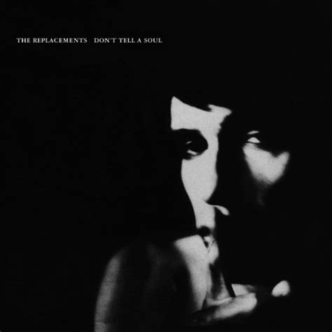
Paul Westerberg's finger on lips, hushing pose, is an iconic image if you're my brand of music fan. And the album cover sells mystery and secrecy. Which would be perfect for a book cover. Except...well, look at it. Is it any wonder that album wasn't a hit? They're not exactly reaching out to you and saying 'come hang out in our world.' 

So I looked first at paying a homage to the album in a way that fans would recognise, but aiming broader with a New York cityscape - matching the book's setting. And I looked around at typeface's that seemed popular, and of the current contenders I liked Futara the most. 


You know...I mean...fine? But it didn't really scream professional to me, and the face looked too young. I didn't see anything here that would make it stand out, or make a reader want to pick it up. Okay, first thing first, what am I feeling? It's a mystery novel. Okay, why don't I put that on the cover? 


Hmmm. But now it looked both cheap and busy. Not exactly the message I wanted to send in my "come buy my commercial crime novel" bid. 

But that was a nice shot of the city. Maybe try without the face?


I liked this. I really did. But it just didn't quite feel like the cover matched the tone of the book. And I was attached to the idea of the shush. There's just something intriguing and mysterious to me about that image. So I played around. 


PERFECT. Done. Set Print. Thrilled with that. So I walked away from the project for a week, came back to it, took one look, and thought.....this is a romance thriller? 

Okay. Scratch that. Ditch the colours, ditch the NYC cityscape. But the shadowed face? Keep that. 


Iiiiiiinteresting. I liked this. The people I showed it to liked it. But my author name was small and dark, and too many books seem scared of their author's name. Commercial books? They don't hide from the author's name. A friend suggested I could do something interesting by making my name look like it was attached to the wire mesh. Play around again....


Oh boy. Loved this. Once again, print, set. Add a spine and a back, stick a fork in it, done. 


Left it like that for months. Until I came back, looked at it and....it was a graphic novel? Actually, someone else had given me that feedback and I'd ignored it. But now I was seeing it. I'd lost sight of both remits. It was neither an interesting tribute to a cult album, nor a commercial package. Now it was it's own coolish looking thing. Which 100% appealed to me. But I'm not the target audience - I already have the book. 

Back to the drawing board. Refocus on the project. What am I aiming to sell? What message do I want to get across. Okay, go again...


Okay. Nice and clean. Simple. Title was clear on a thumbnail. But now it just looked like it was lacking....something. 

Smoke maybe? Smoke is interesting. People put smoke on things. 


Oh hey. I like that. But what does it look like if I tweak the colours a wee bit more, and finish out the rest of the cover? 


Sold. 

Don't Tell a Soul will be released in ebook and paperback on July 26th, and available wherever books are sold. Except for that van that comes round after dark and offers you cheap televisions. Don't touch his book section. 

Oh, and did I mention I can design a book cover for you? I can. Hit me up. 


Sunday, March 8, 2020

Exercising My Rights

By Claire Booth
I'm thrilled to unveil the new covers for the first two books in my series. I've re-acquired the rights to them and so am able to use my own covers when I put them up for sale as an ebook (and as a print book, but that will come later). I found the perfect designer, who absolutely gets the vibe of the series and gave me these wonderful, foreboding, ominous covers.
They're up on Kindle as of today and will be available elsewhere soon.
The Branson Beauty on Amazon.
Another Man's Ground, on Amazon.


The series now also looks consistent. This is Book Three with my current publisher, Severn House.
https://www.amazon.com/Deadly-Turn-Hank-Worth-Mystery/dp/0727888455/ref=sr_1_1?keywords=a+deadly+turn&qid=1583687334&sr=8-1
A Deadly Turn.
 
And I'll have news about Book Four, also from Severn House, very soon.

Monday, April 23, 2018

A Feast For The Eyes

According to Forbes and other sources, 65% of people are visual learners.

And, as Study Mode Research claims, the human brain processes visual information faster than text.

It's impossible to deny that we're often drawn to people based on how they look. The visual component is very important to most people. Everything from choosing our favorite colors to selecting clothes to buy relates to appearance.

This is part of the reason why it's important for aspiring authors, and all authors, to think visually when they're writing. I spent many years working with creative writing students and one of the things I talked about a lot was writing to the senses.

Visual writing should be eye candy.  It should all speak to my eyes and give me a clear picture so that I can see it in my head. It's your job to make the reader feel as thought they can close their eyes and see what you're writing about.  You can't presume knowledge on the part of the reader that goes beyond the information you give them on the page.  The purpose of this assignment is to evoke a clear image related to the sense - in this case, sight. 
Consider this example:  The beautiful woman crossed the street.  It really tells you nothing, other than that the POV character in the scene noticed this particular woman.  Why?  Was it the long, flowing brown hair?  Was it the long legs?  Was it the sparkling green eyes?  Was it the creamy skin, offset by the flowing auburn curls?  There are so many missed opportunities in a generic statement like this one, because it could have told me how the POV character defined beautiful, what struck them about the woman.  I also know nothing about the street.  Was it a quiet, dead-end street where the pavement gave way to packed dirt?  Was it a busy multi-lane road filled with impatient drivers and honking horns? 

Of course, it was easier for me to tell students this after learning the hard way. It was something I got hammered on in an early draft of Suspicious Circumstances - my characters were blurry heads talking to each other in white rooms.

In other words, I hadn't done enough to generate a clear visual image of my characters or the settings for the reader. Developing visual images in your mind as you write is important because it will help ensure that you create a visual feast with your text that readers will appreciate.

In the years since then I've learned that it isn't just important to think about the visual elements as you're writing for the sake of your story. It's important to think about the visual elements so that you can contribute effectively when it's time to talk about your book cover. Sometimes the author has little input and is left with whatever the publisher offers.

However, many times, publishers are receptive to suggestions, particularly if they're provided in a timely fashion. And many small presses are not only receptive; they welcome or request input from their authors when it comes time to talk about cover design. The thing about your book that will reach more potential readers than likely anything else is your cover. People will see it online, on social media, on your website and on bookselling sites.

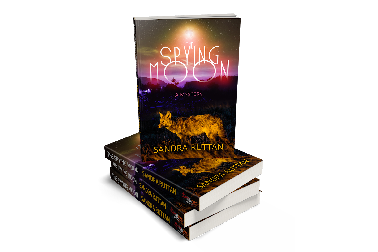
I was fortunate. Down & Out not only welcomes input from authors; they request it. They took my suggestions and produced a cover that exceeded my hopes. And today, I can finally share the cover for my new book, The Spying Moon, with you.


Getting a fantastic book cover is better than getting a new outfit for a party. This is the moment authors are working towards. Nothing does more to make your book seem real than seeing what your physical book will look like. Infusing your work with strong visual elements and you won't just make your readers happy; you'll find the heart of your story represented in the artwork on the cover.

Having a publisher and designer who really nailed the cover is one of my greatest joys in publishing to date.

Saturday, December 3, 2016

Picking a Cover With 99Designs...and a Request


By
Scott D. Parker

Let me just tell you how awesome 99Designs is.

Sure, back in September I wrote about the site that allows authors like me to interact with graphic designers all over the globe. It got me the cover of Ulterior Objectives, over there on the right. But I want to extol the awesomeness that is 99Designs again…and ask a little favor of y’all, too.

As a refresher, 99Designs is a venue where anyone who needs a book cover, logo, website landing page, or almost any other type of graphic can start a contest. With a written description of what you want including any images you may want to include as reference, designers will take a look. If they decide to give your contest a go, they’ll submit designs. Along the way, you, the contest initiator can interact with the individual designs via private conversations and star rankings. By the end of the qualifying round, you should have a pretty set of designs.

The book in question is Always Bet on Red: A Rogue Gambler Western. The main character is John Denton, professional gambler, who rarely is in one place for long. He lives on the road and by the cards. But he’s feeling the pull of home, and the closest thing he’s got to a home is in a little town in Texas where his best friend, Eli Jones, is sheriff. During a poker game, an agitated man bets the deed to a saloon he owns. Denton knows he has a winning hand, but Jones sees the saloon as a way to get out of the gun fighting business. Denton folds and Jones wins. Within an hour, Jones is dead. Denton saw the murderer, but the killer gets away. The next thing Denton knows, he’s being accused of the crime. The only way he can clear his name is to find the killer himself and bring him to justice even if it means defying the gambler code of honor.

I ended up with 71 different designs! Now, to be honest, some were variations on an original version or a designer taking into account feedback I delivered. But still. Seventy-one designs from which to choose. It’s an embarrassment of choices. Some were easily dismissed while others were fantastic. One of my friends in my local book club is a graphic designer and, in his words, “…you have an insanely talented batch of [designers]. These are pro level designs for the most part!  Some of these are so good, and clearly so time consuming, I'm blown away.”

I think a key aspect of this contest is that I chose a blind contest. What that means is the other designers cannot see what I’m seeing. They have only my description. Going forward, I’d recommend using a blind contest every time.

The possibilities ranged from traditional western to the untraditional, the cartoony to the photorealistic. I wrote to some designers that the book in question doesn’t match the cover submitted…but that I wanted to write the book that would fit some of these covers. I recently went to Barnes and Noble and examined the westerns and the covers of the paperbacks and hardbacks there. A few of the covers I received could easily be on the shelves in any bookstore.

Y'all wanna see some? All you have to do is click on this link. You’ll see 8 designs—in no particular order—and you can vote. I have to select the Top 6 by Monday, so if you’re gonna vote, please do it by Sunday, 4 December.

These are exciting times to be an author! Especially when you can get covers like these. 

If you have any other feedback, just leave me a comment.

Saturday, October 1, 2016

Cover Reveal and Free Sample: ULTERIOR OBJECTIVES


by
Scott D. Parker

When you’re a writer, you always want to share your books with the world. But when the book in question is your favorite, then the excitement is just that much higher.

In a month, ULTERIOR OBJECTIVES: A Lillian Saxton Thriller, will be released. The tagline is this: What if the only way you could discover who killed your brother was to lie to your commanding officer?

In the order of the ongoing series of World War II-era novels I’ve published, this one actually ends up being the second. WADING INTO WAR is the first. The closing chapter of that novel is the opening chapter, from a different perspective, of ULTERIOR OBJECTIVES.

When it came time to design a cover, I wanted ULTERIOR OBJECTIVES to stand out from the other three novels to date. This is a special novel for me, partly because my dad helped brainstorm the big themes on a drive from Dallas to Houston last summer. I wanted a cover that would mirror this book’s big action.

One of the big set pieces of the story is a car chase. Lillian’s car, a convertible, is being tailed by another automobile and two motorcycles. Lillian isn’t driving, so it’s left to her to deal with her pursuers as best she can. I wrote the scene with a huge grin on my face, and I knew that this was the scene for the cover.

I had a particular scene in mind, and I also had an inspiration: Clive Cussler. If you look at nearly all of his modern covers, there is a commonality to them. You’ve got the title, his name, and the subtitle of whichever character is featured. That is what I wanted.

As I wrote a few weeks back, I went to 99Designs.com to conduct a contest. Bob, from B&J, created the perfect cover for ULTERIOR OBJECTIVES. And, without further delay, here it is.


I love the little details Bob drew. Lillian’s hair flying around as her car speeds down the road. Tire marks on the road. The bad guy driver, visible, but in shadow. Cool explosion of one of the motorcycles. Needless to say, when Bob presented me with this cover, I was ecstatic.

As good as that cover is, the book is just as good. And guess what? I’m sharing the first 5 chapters with anyone who wants to read it.

I’ve set up an account at BookFunnel. If you click this LINK, you’ll be able to download a mini-ARC. You get the first 5 chapters of ULTERIOR OBJECTIVES as well as some samples of the other books and short stories I’ve published.

So head on over to BookFunnel--a great site to upload free books and ARCSs--and pick up your copy—mobi and pub—of the mini-ARC. Then, come November, you’ll get to read the entire novel.

Psst. If you just want to read Chapter 1, it’s available right now at my blog.

I made this offer to my mailing list and I’ll go ahead and make it here as well. If anyone wants to receive a copy of the entire novel ahead of the publication date, I’ll be happy to give you a free ebook. My only request would be that you provide an honest review on Amazon, Kobo, GoodReads, Barnes and Noble, Apple, or any other online store. If you are interested, please comment or send me an email.

So, what do you think of the cover?