Showing posts with label covers. Show all posts

Monday, April 23, 2018

A Feast For The Eyes

According to Forbes and other sources, 65% of people are visual learners.

And, as Study Mode Research claims, the human brain processes visual information faster than text.

It's impossible to deny that we're often drawn to people based on how they look. The visual component is very important to most people. Everything from choosing our favorite colors to selecting clothes to buy relates to appearance.

This is part of the reason why it's important for aspiring authors, and all authors, to think visually when they're writing. I spent many years working with creative writing students and one of the things I talked about a lot was writing to the senses.

Visual writing should be eye candy.  It should all speak to my eyes and give me a clear picture so that I can see it in my head. It's your job to make the reader feel as thought they can close their eyes and see what you're writing about.  You can't presume knowledge on the part of the reader that goes beyond the information you give them on the page.  The purpose of this assignment is to evoke a clear image related to the sense - in this case, sight. 
Consider this example:  The beautiful woman crossed the street.  It really tells you nothing, other than that the POV character in the scene noticed this particular woman.  Why?  Was it the long, flowing brown hair?  Was it the long legs?  Was it the sparkling green eyes?  Was it the creamy skin, offset by the flowing auburn curls?  There are so many missed opportunities in a generic statement like this one, because it could have told me how the POV character defined beautiful, what struck them about the woman.  I also know nothing about the street.  Was it a quiet, dead-end street where the pavement gave way to packed dirt?  Was it a busy multi-lane road filled with impatient drivers and honking horns? 

Of course, it was easier for me to tell students this after learning the hard way. It was something I got hammered on in an early draft of Suspicious Circumstances - my characters were blurry heads talking to each other in white rooms.

In other words, I hadn't done enough to generate a clear visual image of my characters or the settings for the reader. Developing visual images in your mind as you write is important because it will help ensure that you create a visual feast with your text that readers will appreciate.

In the years since then I've learned that it isn't just important to think about the visual elements as you're writing for the sake of your story. It's important to think about the visual elements so that you can contribute effectively when it's time to talk about your book cover. Sometimes the author has little input and is left with whatever the publisher offers.

However, many times, publishers are receptive to suggestions, particularly if they're provided in a timely fashion. And many small presses are not only receptive; they welcome or request input from their authors when it comes time to talk about cover design. The thing about your book that will reach more potential readers than likely anything else is your cover. People will see it online, on social media, on your website and on bookselling sites.

I was fortunate. Down & Out not only welcomes input from authors; they request it. They took my suggestions and produced a cover that exceeded my hopes. And today, I can finally share the cover for my new book, The Spying Moon, with you.
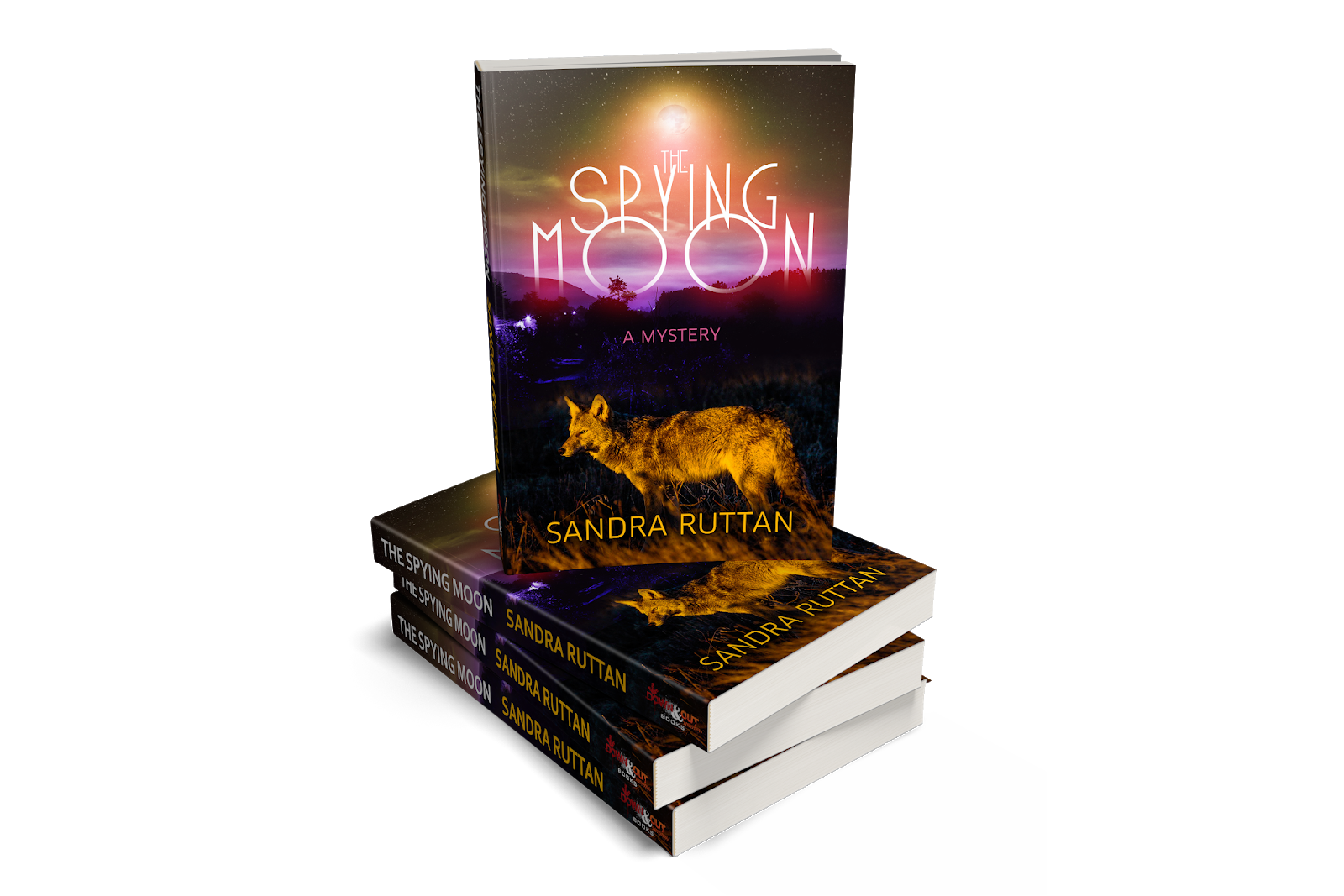

Getting a fantastic book cover is better than getting a new outfit for a party. This is the moment authors are working towards. Nothing does more to make your book seem real than seeing what your physical book will look like. Infusing your work with strong visual elements and you won't just make your readers happy; you'll find the heart of your story represented in the artwork on the cover.

Having a publisher and designer who really nailed the cover is one of my greatest joys in publishing to date.

Saturday, February 7, 2015

Wading Into War: Cover Reveal

By
Scott D. Parker

I'll admit something to y'all: this is a bit exciting for me. Well, let me take that back. This is a lot exciting.

When you are in the position of creating cover art for your debut book, two things run through your mind, at least they did for me. One is the knowledge that the cover will be the first cover for a book you've written that the world will see. For better or worse, the reading public will identify you with that cover. I know I do that with the authors I like. When I think of Dennis Lehane, I think of MYSTIC RIVER and the hardback cover art. 


His other covers flow through my mind but only after I see that 2001 novel. The same holds true for movies. This is always the first image I think of regarding Star Wars.


With all of that pressure in mind, my first cover had to be something of which I was proud. More to the point, it had to be the physical embodiment of what I saw in my head. WADING INTO WAR is a period piece, set in 1940. That’s deep in the heart of the pulp era and I wanted a cover that reflected that vibe. Moreover, I wanted cover *art*, a picture that illustrated a scene in the book. Lastly, I wanted to put my own stamp on it, to bring my quirky vision to this project.

So here it is.


Font: With this being a period piece, I wanted the title font and the shape of the letters to give the reader a clue to the contents. I think art deco is a great font and it instantly sprang to mind when I envisioned the cover.

Colors: Most of the old pulp magazine covers blared out of the newsstand with vivid colors. I, on the other hand, wanted a more black-and-white image. I’ll be honest that the style of the Batman Animated Series was my inspiration for the figures. The primary color is yellow, partly for its ability to stand out in a crowded ebook field but also as an homage to the old pulp magazines that had a monocolor cover with art on top of it. The blood is the jump color to let the reader know that dude in the house means business.

Logo: Initially, I wasn’t going to have the logo on the cover. Then, after my last markup to my graphic artist, I realized I had a blank space. Enter the logo. And, frankly, it hearkens back to the things I first read: comics. Again, a deliberate choice.

The Graphic Designer

Speaking of all this, you may wonder if I’m a multi-talented renaissance man who can write as well as design. Wonder no longer: that ain’t me. But I had the perfect solution.

A good friend of mine and former co-worker, Ike, was more than happy to accommodate me. You have already seen his good work with the logo for Quadrant Fiction Studio and now you have evidence of what he can do for a book cover.

When Ike and I worked together at our day job, I used to joke that he was halfway finished with a project before I was even finished telling him what needed to be done. He’s an intuitive artist who can give you exactly what you want but will also guide you into making better decisions. He fully cooperated with me in all my weird ways of trying to describe what I wanted. We no longer work at the same day job and our homes are across Houston from each other so we relied on emails and Skype calls. He never batted an eye, even when I’d ask for a little tweaks multiple times. Ike was nonplussed. In fact, the more this project went on, the more enthusiasm we both showed for this final product.

And it shows. I can think of no better compliment for Ike than this: without him and his willingness to work with me and his excellent ability to create something from nothing, this cover, this work of art that I saw in my head, would not be real. It would still be inside my head.

But it isn’t. It’s out here, for all the world see. Thanks, man, for making a dream a reality.

Sunday, March 30, 2014

The Stars Aligned

By Kristi Belcamino
I’m just going to say right off the bat that I’m a little bit intimidated to even attempt to fill Joelle Charbonneau’s shoes on this amazing blog.
Why? Well, because she’s a rock star.
Joelle is one of the most dedicated and talented writers I know. And for some reason, I’ve been lucky enough to have her in my corner for the last few years. Damn lucky.
We first met when she judged a contest I entered. She wrote her name on my judging form, and asked me to keep in touch. Ever since that day, she’s been one of the most supportive and nicest writers I’ve ever met. And as I got to know her, I soon realized she was by far one of the hardest working writers out there, as well.
So when Joelle asked me to take her spot here at Do Some Damage on Sundays, I was floored, flattered, and thrilled at the same time. She’ll be back to guest post and I made sure to tell her if she ever changes her mind, this spot is really and truly always hers.
By now, though, you’re probably wondering who is Kristi Belcamino.
I’m a crime fiction writer, Italian mama of two feisty little girls, and a part-time newspaper reporter living in Minneapolis. My first novel, Blessed are the Dead, goes on sale June 10th. It’s inspired by my dealings with a serial killer when I was a full-time cops reporter working the San Francisco Bay Area crime beat.
When my editor and publicist found out I’d been asked to join Do Some Damage, they immediately suggested I reveal the cover for my new book here first. (Just shows how respected and beloved this blog is.)
Steve Weddle was gracious enough to give me the thumbs up on revealing my cover as part of my first post and the stars aligned.
Before I do so, I want to thank Steve and Joelle and all you loyal readers for allowing me to take over the Sunday spot on this blog. I’ve got a bunch of ideas for posts, but am also very excited to hear what you’d like to read about, so feel free to shoot me an email at kristibelcamino@gmail.com and tell me your thoughts and ideas. You can also find out more about me at my website, www.kristibelcamino.com or on Facebook at https://www.facebook.com/kristibelcaminowriter.
Thank you so much for allowing me to be part of Do Some Damage!
Here is the back cover copy for my book, Blessed are the Dead

To catch a killer, one reporter must risk it all...
San Francisco Bay Area newspaper reporter Gabriella Giovanni spends her days on the crime beat flitting in and out of other people’s nightmares, yet walking away unscathed.
When a little girl disappears on the way to the school bus stop, her quest for justice and a front-page story leads her to a convicted kidnapper, Jack Dean Johnson, who reels her in with promises to reveal his exploits as a long-time serial killer to her alone. Gabriella's passion for her job quickly spirals into obsession when she begins to suspect Johnson may have ties to her own dark past: her sister’s murder.
 Risking her life, her job, and everything she holds dear, Gabriella embarks on a path to find answers and stop a deranged murderer before he strikes again.
Perfect for fans of Sue Grafton and Laura Lippman's Tess Monaghan series!

If you want to preorder a copy of the book you can do that here.  
If you don't want to wait, keep an eye on my Facebook page. You might just have a chance to win an early copy. 
And (drumroll please) here is the cover:


Friday, July 1, 2011

The Case of the Deadly Designer

By Russel D McLean

Hey, check out these beauties.


See these covers, they were designed for the digital editions of my books. Well, onehttp://www.blogger.com/img/blank.gif’s the UK Digital edition of THE GOOD SON and the other’s a short story collection that’s going to be available to wherever you are once the final element falls into place.

In this case, its not the content that makes me proud, but the covers. Those covers are something else, believe me. And they were designed by one of the most talented guys in the business, JT Lindroos. It was Allan Guthrie who pointed me to JT when we were looking to find a cover for THE GOOD SON. I was impressed by what I’d seen him do on Guthrie’s covers and when I realised he was one of the geniuses behind Point Blank Press (who debuted, among others, Guthrie himself, Ray Banks and Duane Swierczynski) I thought, yeah, this guy’s worth approaching. A few emails later, he had the feel of THE GOOD SON down in a way I never expected.

Thing was, THE GOOD SON had a clear brief. When I went back to him with a series of linked short stories, my brief was less clear, maybe more muddled. But we worked back and forth on a while and in the end he did the unexpected and gave me a very cool, very moody cover for the mooted THE DEATH OF RONNIE SWEETS that did everything I wanted and maybe even a little more. He’s been a pleasure to work with and an absolute professional throughout. Go check his website right here to see other examples of his often fantastic cover work, for e-books, for book covers, for all kinds of things.

I mention JT today for two reasons. One is that, as anyone who knows me will attest, I’m a cover snob and a real stickler for what I consider to be good design work. JT nails his work, he really does, and its no wonder that so many people return to him for repeat business. He’s got an eye for the eye-catching and understands about the mood of the work he’s representing.

And less you think he is merely a cynical, crime-fuelled psychotic, he has a softer side too as evdienced by this cover for a good friend of mine, the romance writer, Holly Millar:


And the second reason is that JT turns 40 today. Yep, they say that’s when life begins, and for a man with JT’s talent and expertise, I’m sure it really is only just beginning. So this post really is just an extended way for me to say, happy birthday, JT, and thanks so much for the fantastic cover designs*.

*And a happy birthday from Holly, too.

Sunday, May 8, 2011

Do you judge an e-book by its cover?

by: Joelle Charbonneau

So – e-books have changed the publishing game. While I don’t favor reading books on screen, I am willing to admit this is true. I’m also willing to admit that many things about the purely e-book publishing model baffle me. (For the purposes of this particular discussion purely e-book refers to both the e-publishing company versions as well as the self-published books equally.)

Take covers for instance. I understand why covers have always been important for a book. As a reader browsing the bookstore, the cover will either have me picking up a book I was otherwise unfamiliar with or rejecting it before ever reading the flap copy. People say you can’t judge a book by its cover – but really – isn’t that what covers are for? I judge them all the time. For good or for ill, covers are the main marketing tool in a bookstore. (This only works for the author if the bookstore actually stocks the book – but that’s a discussion for another day.)

What I don’t understand is whether covers have the same importance in the virtual bookstore. Yes – an e-book only author still needs a marketing tool for their website, social media and the blogs they might visit. Covers are great for that. And if you are with an e-book publishing company you probably get your cover displayed along side other covers on their website. That’s good, too. But does an e-book cover have the same ability to invoke impulse purchases that a physical cover does?

I don’t know. Honest. Perhaps this is because I don’t peruse the virtual shelves the way I do the physical ones. In the physical store, I’m looking for the unknown author – the next great gem that I can’t wait to delve into. In the virtual store I’m searching for specific authors and titles. I find them. I buy them. I leave the website. I don’t browse.

So I guess I’m looking for the real e-book reader (which clearly isn't me) to give me their perspective. How important is a cover to you in the digital world? When you’re searching for a specific title does the cover help you decide whether or not to hit the buy button? Or are you like me? Are you searching for authors you know either personally, virtually or through their previous work where the work is more important than the image on the screen? How do you do your e-book shopping? Does the virtual cover truly make the same impact as a physical one? Tell me! I really want to know.

Friday, August 27, 2010

"She Made a Beautiful Corpse"

By Russel D McLean

Those of you who know me know that I have a weakness for old painted pulp covers. Several bookshelves are dedicated to my favourites, but this week I decided to bring out some examples of these works of art to show you. Many of these were originally used as covers back when Crime Scene Scotland was a monthly ezine. Rooting through old files brought back memories of where I found these books, and some of the questions and thoughts they brought up. So enjoy a small peek at my covers. I'll maybe scan some more another week. This is only the tip of the iceberg, and a reminder of how cover art used to be a truly individual thing.


The Corpse in the Corner Saloon was bought in the book room at my first Bouchercon (Chicago).

One of the things I love about it, more than the gorgeous painted cover, is the fact that it also came with a map of the crime scene. Its my understanding that a lot of Dell books did this at one time, and it is a fantastic idea.


The second cover here, A Date With Death, was again bought on a trip to the states. This time, I was in New York back when I was considering attending NYU as a philosophy graduate. In the end, of course, I elected for Bristol which had a better course and then dropped out of philosophy altogether due to the costs involved. Anyway, this one has a very special place in my heart and I love the strapline: "She made a beautiful corpse".


I love my Ross McDonald books. So when my dad found this Spanish edition of one of McDonald's books (I'm actually not sure which one this is - anyone care to enlighten me?) I was delighted. Its a very simple but effective cover, and while not down to my usual pulp styles has pride of place in my bookcase.


The Books of Master Crimes was bought back in the days when I tried my hand at bookselling. Its one of my intial stock that I have left. And all because I love the cover. This one's a magazine anthology, and again its that painted cover that gets me every time.


Dark Crusade is another oddity in my collection. Its got he babe, the guy in the tenchcoat and of course the communist espionage. But can anyone solve this mystery from the back cover for me? Apparently Grant Holmes "is the psuedonym of a well-known American detective story writer who has written this hard-driving thriller on the strength of his own experiences at the head of an allied bueaur of intelligence and counter-intelligence in England and on the continent during the last war." Can anyone source me the real identity of this writer? You'll get the DSD equivalent of a no-prize, and you know those have gotta be coveted.

Friday, February 19, 2010

Cover Stories

By Russel D McLean

I’ve talked about this before on me main blog, but again I’m thinking about covers. Following my reading recently of Barry Eisler’s “open letter” to his French publishers (and all publishers) I’ve found myself thinking about covers. And its true that covers affect the way I think about a book.

One of my favourite series of covers, as anyone whose heard me wax lyrical on the subject will know, was the sequence of covers that Serpent’s Tail did the early books of George Pelecanos. Indeed, it was the cover of the sublime King Suckerman that persuaded me to get into Pelecanos in the first place.

The immediately recognisable reminded me just a little of the old Elmore Leonard covers I used to buy my dad when I was a kid. They were two tone, simple designs, and absolutely striking. Strange as it sounds, one of my main memories is me and mum trying to decide which Leonard to buy him based on the colours of the covers (we couldn’t have told you the titles – I was too young and mum, well, she wasn’t a Leonard reader). I’ll be honest with you, much as I love Leonard’s books, the covers have never really been as striking since.

I love the idea of branding in that sense. Not every Leonard book is the same inside, but outside you knew you were getting a Leonard. Same with Pelecanos – an author who, despite some hiccups, has generally had his own branding from the brilliance of Serpent’s Tail through to the simple “crime tape” tagging of a couple of years back to the stark white and blue covers that predominate his current incarnation. And I couldn’t go without mentioning the old Richard Stark covers – the ones with the bullet hole in the front and the tagline: “A novel of violence”. Everything you need to know, believe me.

I also love the whole-series branding that is happening in the Hard Case Crime Line-up. Not every cover painting stands equal (some I like less than others), but again you are hard pressed* to mistake them for anything else.

Interesting aside note – I managed to grab an early copy of one of HCC’s first books – Allan Guthrie’s excellent Two Way Split – which was actually part of print run that was somehow damaged. The cover wore easily, cracked and peeled. But the strange thing is that given the nature of the HCC design, this really looked right and the edition now stands proud among the real old pulps that clutter my bookshelf, looking like it belongs, like it was truly part of the era it is echoing.

But I digress. And to return to covers, let’s boil it down like this: I like strong images. I like an uncluttered feel. I like something original. Something that says: this is what’s going on. So in one sense, myself and Mr Eisler agree on that: a cover should not only be strong, it should vibe what’s inside the book.

Where we disagree of course, is over his choice of cover preference. While Eisler prefers his UK covers, I find them overly busy and muddy. The French cover – while, perhaps, not capturing the mis-en-scene of an Eisler novel, is less cluttered and more clear to my eyes. Which goes to show that sometimes, cover art is in the eye of the beholder.

So how would one convey an action cover well?

I do like the cover to Sean Black’s recent thriller, Lock Down. The cover is busy and explosive, but the focus is on the title and the central explosion, unlike the Eisler covers where the eye is not drawn to any one thing in particular (other than the title, but beyond that? I just see a morass of colours).

One of the best covers I’ve seen in ages plopped its way into my inbox recently – the cover for the upcoming Busted Flush anthology, Damn Near Dead 2. It’s an absolute doozy, and conveys precisely the tone of the anthology while managing to stand out from the crowd effectively. In fact, I’d say that as BF are continuing, their covers are getting better and better. Simple, clear and effective. Not branded in an HCC sense but perfectly adapted to their authors.

And I think that’s the key – so many covers fail to create a proper sense of the book inside through sloppy design or inappropriate imagery. There is more to cover design than you might believe, even if so many houses seem to believe that copying another author’s style may be the key (step forward the Da Vinci Code Rip Offs and the Lee Child Alikes, please). Those that get it right create mini masterpieces. Does it tell you anything that I have a collection of old paperbacks collected not for the stories inside, but for the love of the covers, of the moods and ideas they represent?

And, of course, inkeeping with this week’s theme, I give unto you the cover of a book by a guy who’s a hell of a writer… oh, yes, we warned you it was McFetridge week here at DSD…

*was that a pun? It was nearly a pun.

Friday, October 16, 2009

The Invisible Author

Russel D McLean

I read something fairly radical (well, as radical as things can get in publishing – sometimes its just thinking about things in a way that goes against tradition) the other day that got me thinking. It was a throwaway comment on the blog of John Rickards. John is about to start a new phase of his career under the name Sean Cregan; it’s a reinvention, a whole new angle on his writing (from what I understand – I haven’t read the book yet).

But when he posted his cover – marvellous looking as it was (if the book’s half as fine it will be worthwhile, I reckon) – I was intrigued by the comment below from Kevin Wignall (another writer you should seek out immediately):

I think there’s an argument for not having the author on the cover at all. Why? People looking for the book will spot “The Levels”. Casual browsers will see a cool cover and wonder who it’s by. They’ll have to pick it up to find out and getting them to pick it up is half the battle.

Extrapolating* from this, I could see the argument for having (for example) “A Rebus novel” in big print but still not having Rankin’s name so prominent. And it would also take the onus of the current “author as celebrity” thing and allow readers to select books based on whether or not they believe it would entertain them. And yes, as an author, I can see that it’s a blow to the ego not to have your name on there, but what I’m saying is that there is often far too much attention paid to the author as brand when, we should always remember: its about the story, stupid. People joke about Dan Brown just copying down the phone book and it would sell, but the way that we have set up the current system that could possibly happen because the focus has gone off the book and onto the author. And maybe I’m naive or just remarkably ego free, but I would rather people just enjoyed the damn books.

I imagine it might also free up many authors creatively – allow writers to spread their wings more often rather than try and further their “brand”. And perhaps it would free up the reader, too. Rather than relying on branding, they would be reliant on genuinely considering the book based on synopsis, perhaps even the first few pages.

Now I’m not proposing that we take the author’s name away entirely. That would be stupid. They have, after all, put the bulk of the work into the novel. But is the author’s name really so important as we think? Does it need to be so prominent?** After all, so many readers read one book by an author that doesn’t appeal to them and say, “Well, I’m never reading them again”*** whereas by taking the focus off the author and on the title and the book itself, we are inviting those readers to return when the author writes a different book that might appeal more. The branding in this case could be working against the author rather than for them. And I’m sorry, but even my writing heroes have written one or two books I didn’t quite get

Looking at my shelves, I see movies with simply the title on the sleeve (occasionally the star or the director, too, but only the most bankable names and very rarely). On book spines, I see DEAVER is huge capitals and the title in tiny lettering. Same with BATEMAN, BILLNGHAM, MACBRIDE, KING etc etc. The brand of the author overwhelms the autonomy of the book as an entertainment entity in and of its own right. Why would I pick up movies just from the title and cover art, and books because of the author? They are both doing the same job: storytelling. The medium, yes, is different, but ultimately there is not so much difference as some people are keen to make out. It’s all narrative storytelling. Like visual artists arguing over oil paintings and sculptures as the “purer” medium in which to work.

I don’t claim to have all the answers – in fact I suspect there are probably a number of reasons why I’m wrong – but I wonder what would happen if we took the ludicrously large author brands off books, focussed on titles and plot hooks and arranged books by title and not author. In particular, I wonder if it might help newer authors establish themselves (and their books) rather than the patently silly practice that is currently ongoing where, if we put a debut author’s name large enough on the cover we might fool people into thinking they’ve been around for years and are therefore very important.

I don’t know that it would work, but I think its something worth discussing, and it strikes me there might be a number of arguments in favour of detracting from the author and focussing on the book itself when it comes to packaging and covers. It would probably mean an overhaul of the way bookshops work – could you imagine searching by title and/or series? – which means that I doubt it will happen or become practical, but its food for thought in an age where we really want people to start picking up books and thinking of them as equal to other forms of entertainment that occasionally seem to take consumer’s cash with far greater ease.

*See, I learned a couple of big words doing philosophy after all!
** I like that on the cover of THE LOST SISTER, while my name as author is clear, it really is the title that grabs your attention.
***And yes, it happens. I’m sorry. But readers are fickle creatures.