By Jay Stringer
So, it's official. I have a new book coming out. In July. On my birthday. You want to buy me a book for my birthday, right?
There will be three editions. The ebook -currently available for preorder on kindle, awaiting upload to different vendors. The standard edition paperback. And a dyslexic reader edition - a paperback formatted in the OpenDyslexic typeface, making it easier for people like me to read. The option to convert work to OpenDyslexic on the Kindle has existed for quite a while (check out the font options) but it's important to me that we find ways to make paperbacks as accessible as possible. I'm putting this book out myself, through my new Swag Tales imprint, and that has given me more freedom than before to produce and market the book in a way that I'm happy with, and in formats I want to see on the shelves.
But I will talk more about the dyslexic edition at a later date, along with throwing ISBN's and preorder links your way.
Today, I want to talk about the cover.
I like cool book covers. Quite a lot of what I like, visually, is niche in the modern market. But what's the point in putting a book like this out if I'm not going to try and at least meet the market part way? What would be the point in coming out with the dyslexic edition and preaching accessibility if I didn't do my best to make the book accessible?
So for the first time, I took a look at the market, and tried to decide what the cover should look like. At the same time, the title is a clear homage to my favourite band (ironically, my least favourite of their albums) and so I was pulled in two different directions. Aim surely commercial, or aim niche and tip the hand to The Replacements?
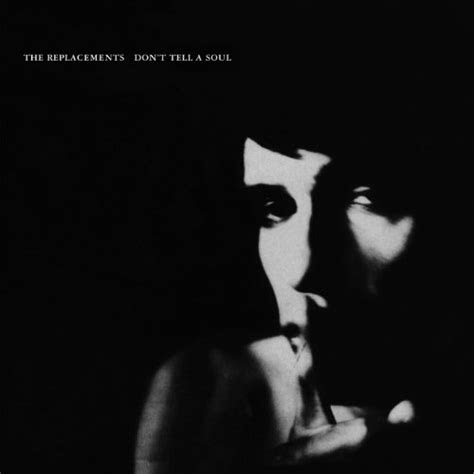
Paul Westerberg's finger on lips, hushing pose, is an iconic image if you're my brand of music fan. And the album cover sells mystery and secrecy. Which would be perfect for a book cover. Except...well, look at it. Is it any wonder that album wasn't a hit? They're not exactly reaching out to you and saying 'come hang out in our world.'
So I looked first at paying a homage to the album in a way that fans would recognise, but aiming broader with a New York cityscape - matching the book's setting. And I looked around at typeface's that seemed popular, and of the current contenders I liked Futara the most.

You know...I mean...fine? But it didn't really scream professional to me, and the face looked too young. I didn't see anything here that would make it stand out, or make a reader want to pick it up. Okay, first thing first, what am I feeling? It's a mystery novel. Okay, why don't I put that on the cover?


No comments:
Post a Comment